Mobile First allows software developers and web designers to write their code once and run it everywhere:
- Desktop web application
- Android Phone or Tablet
- Apple iPhone, iPad, or iPod
- Most other devices that can run web applications
Time to Pivot
I had taken a break from my blog series, SEO Step by Step, because I did not want to violate the main point of lean business: don’t waste time developing the wrong product.
As I worked these last few years developing my software product, a hosted web database application service, I realized that web was becoming less relevant and that a successful software company would need to serve the mobile market.
I looked into creating mobile versions of my business application development platform, dbEasy.com. But I did not want to triple my effort developing for Apple, Droid, Windows and supporting the continually changing device landscape. Luckily I learned about Mobile First.
Now my new (and still unproven) business thesis is that there is a market for a service providing a suite of easily customizable applications that will run both on a desktop computer and on all major mobile devices: smartphones and tablets on all the operating systems.
To help prove my thesis please leave your comments as to whether you agree that this is something people would pay for.
Mobile First
The idea behind mobile first is that instead of developing a desktop web application and then re-developing it for each of the most popular mobile devices you develop for the mobile devices first and then use the same interface everywhere.
The result is that you have a very clean and simple website that also looks good and functions fully on iPads, iPhones, Droid phones and tables, even Windows and Blackberry smart phones. You write the code once and it runs everywhere.
One way to accomplish this through the open source platform, jQuery Mobile, which uses two recent technologies, HTML5 and CSS3. Now a developer can focus on creating the best software to meet the customer’s needs and let the international standards organization and the open source community ensure that the single code base will run on whatever device their clients may be using. This benefits your clients because you can provide more functionality at a lower cost.
Here is an Editor form built using Mobile First:
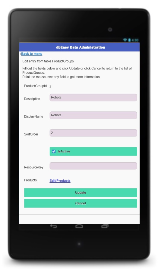
Mobile First features a very simple layout. All the fields and buttons take up 100% of the screen width. They are readable and easy to interact with on a table or a smart phone. When you view the form on a web browser it looks the same: simple.

You may be thinking that this web form is too simple. A web application needs all kinds of bells and whistles and images and side panels and inserts and all that stuff. However, just think about the interface for what is the probably the most successful website of all:

A major factor to the success of Google is their simplicity, only a logo and a search box. If it works for Google, it can work for you. And what’s best is that you only have to develop once. You create an application that works on the smallest mobile screen and when you run it on the desktop you still have a clean UI.
If you want to get a little fancier then you can take advantage of Responsive Design. This means that the design changes with the screen size through the magic of CSS Media Queries. For example, on a desktop it shows three columns:

But on a tablet (or a narrower browser window) it collapses to two:
And on a screen the size of a smart phone all the content stacks up into a single column:
It takes just a little bit of work to set this up. If we want to keep with our philosophy of only coding once to run everywhere then a good strategy would be to use media queries for column layouts and then let jQuery Mobile do the rest, automatically adapting the display for whatever device you are viewing on.
What do you think? If you are a business owner or self-employed person wanting to make more effective use of Internet technology then please leave a comment about what you think of Mobile First.
Or, better yet, if you want to get started with mobile first hosted web database applications then send an email to Ray@dbEasy.com we’ll get you set up fast.


 Lean Business Startup